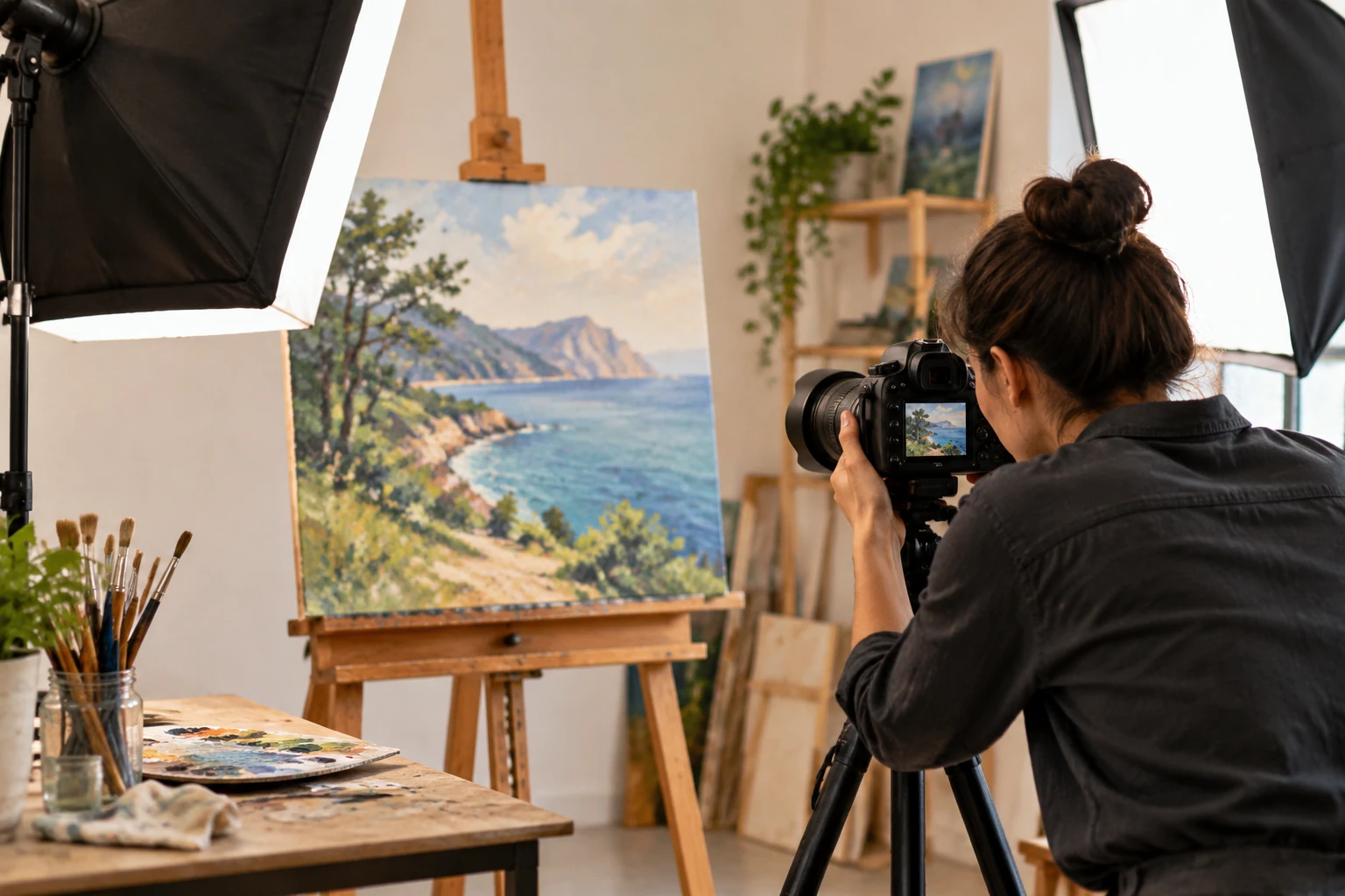
Your art looks different on camera because light, white balance, and lens distortion shift colors your eyes miss. For that reason, a warm ochre you mixed by hand can land on screen as a flat, muddy brown.
Most artists blame the paint or the phone first, but the gap sits in how a digital camera records a scene. At The Heart Project, we hear this from painters who spent forty hours on one piece and cannot get a single honest photo of it.
This guide covers how to photograph art using the light, the settings, and the quick edits that close that gap. Let’s get your work looking like itself again.
Camera Sensors See Light Differently Than Your Eyes Do
Your eyes and a sensor read the same scene by completely different rules, and that mismatch shows up the second you review the shot.
Three differences explain nearly every disappointing result, so let’s take them one at a time.
Comparing Sensor Range to the Human Eye
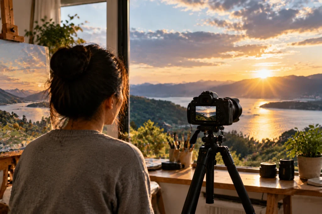
In a single glance, your eyes can take in both a bright highlight and a deep shadow. It spans roughly 30 stops of brightness, all without any conscious effort on your part. That means your vision can handle an enormous difference between the brightest and darkest parts of a scene while still keeping detail visible.
Most sensors capture 12 to 14 stops instead. As a result, the dark corner of a canvas drops to solid black while a pale highlight burns out to blank white.
You know that sinking feeling when the shadows swallow half your texture. Thickly worked surfaces suffer the most here, because every ridge of dried paint throws its own small shadow (impasto is the worst offender here).
Why White Balance Shifts Your Paint Colors
White balance is your camera’s guess at which part of the scene counts as pure white, and it corrects every other color from that single reference point.
That guess fails on artwork because the camera reads the dominant color of the piece as a cast and cancels it out. Because of that, a blue-heavy seascape will come back gray and tired, and a warm portrait will lose the glow you spent the longest mixing.
In our experience shooting hundreds of artist submissions, setting white balance manually against a plain white sheet fixes more color problems than any slider in editing software does.
Common Camera Settings That Skew a Photo
Three settings silently wreck good work: a high ISO, a slow shutter speed, and the wrong focal length for the distance you stand at.
If you push ISO past 800, the sensor will add grain that reads as muddy texture across a smooth surface. Similarly, when you drop shutter speed below 1/60 while holding the camera, small hand movement softens every painted edge.
Focal length carries equal weight, because a wide phone lens bends straight frame edges outward whenever you stand close. To fix this problem, back up two steps, zoom in slightly, and your rectangle stays a rectangle.
Once your settings behave, the light falling on the canvas becomes the next thing worth fixing, and it shifts hour by hour.
Why Does Natural Light Change How Your Artwork Photographs?
Natural light affects how your artwork photographs because the color temperature of sunlight shifts throughout the day and changes every shade it falls on. For example, morning sun measures around 2,000K and spills orange across the surface, while midday sits closer to 5,500K and holds your colors much nearer the truth.
Weather swings that number too, since an overcast sky reads near 6,500K and turns your whites faintly blue across the frame. Still, that soft and even spread beats hard sun for keeping detail in both the darks and the brights.
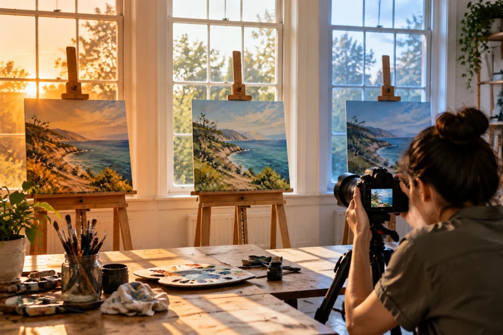
Direct sunlight creates a different problem. They bounce off any varnished surface and straight back into the lens as white hot spots. And no amount of photo editing recovers what the sensor never recorded in the first place (those blown areas are gone for good).
To avoid this issue, we keep coming back to the same fix: a north-facing window on a bright but cloudy afternoon. Set the piece parallel to that window, and the light will fall evenly across the surface instead of fading toward one side.
However, when daylight refuses to cooperate, two daylight-balanced bulbs angled 45 degrees from each side give you artificial light you can repeat at any hour. That repeatability counts most when you are photographing paintings in batches before an open call deadline.
Photographing Your Artwork With the Right Camera Settings
Matching your camera settings to your light source gives you sharper, true-to-life colors every time. Once the light holds steady, your camera stops guessing and begins capturing exactly what is in front of it.
These four tips for photographing artwork work with any digital camera or recent phone:
Custom White Balance: Set your camera’s white balance before photographing artwork by using a plain white sheet under the same lighting conditions. This gives the camera a true color reference and helps paint tones appear closer to how they look in person.
Tripod and Timer: Slow shutter speeds can capture small movements from your hands, even when the image looks sharp on the camera screen. A tripod keeps the camera steady, while a two-second timer prevents movement caused by pressing the shutter button.
Aperture Near f/8: Use an aperture around f/8 to keep the entire canvas sharp, including the corners. Wider apertures create a shallow focus area. This can leave parts of a flat artwork slightly softer than others.
RAW File Format: RAW files store more image data than JPEGs. Plus, they give you more control when adjusting color, brightness, and exposure during editing. On the hindsight, the larger file sizes require more storage space, so make sure your device can handle them.
Tip: Save your camera settings as a preset once they work, since the same setup repeats for every piece you shoot in that spot. Ten seconds of preparation beats an hour of correction later.
Quick Tips: Comparing Editing Apps for Better Photos
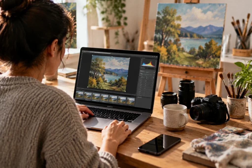
Once your photo looks right in camera, quick edits in the right app finish the job. Final adjustments like cropping to the frame edge and refining exposure usually take only a few minutes per image, especially once the process becomes familiar.
Compare the three tools artists reach for most before committing to one.
| Tool | Cost | Ease of use | Color accuracy for artwork |
|---|---|---|---|
| Snapseed | Free | Beginner-friendly, tap-based | Good, includes a white balance eyedropper |
| Lightroom Mobile | Free basics, about $11.99 monthly | Moderate learning curve | Best, reads RAW files and camera profiles |
| VSCO | About $2.49 monthly | Simple, filter-first | Fair, presets can push colors off |
Verdict: Snapseed covers what most beginners need at zero cost, while Adobe Lightroom earns its price once you export images in batches. VSCO sits between the two. It offers simple editing tools and preset-based color adjustments for creators who want a consistent style without a full professional workflow.
Ready to Photograph Your Artwork With Confidence
Honest photos of your work come from controlling the light first and the camera second, never from buying more expensive gear. Every fix in this guide requires some patience and preparation, but it can help you avoid unnecessary costs.
So what are you waiting for? Pick one piece this week, set it beside a window, and shoot it with your white balance locked. You’ll see the difference before you open a single editing app. After that, share your finished work with The Heart Project and put your art in front of people who want to see it.
Leave a Reply